Product Design
In 2018, when I got promoted to the Manager position, I didn’t stop delivering designs. In 2018, 2019, and 2020 I worked on designs for TV consoles and mobile devices for VRV and Crunchyroll Apps. I stopped working on designs only at the end of 2020 after shipping the so-called “Crunchyroll 2.0” on mobile, web, and multiple TV platforms.
I have designed or contributed to the design of multiple features for Crunchyroll, and I have materials for a book where I would be able to describe all the failures, learnings, successes, and processes. Instead, I will share several features I worked on.
Crunchyroll
Xbox One App
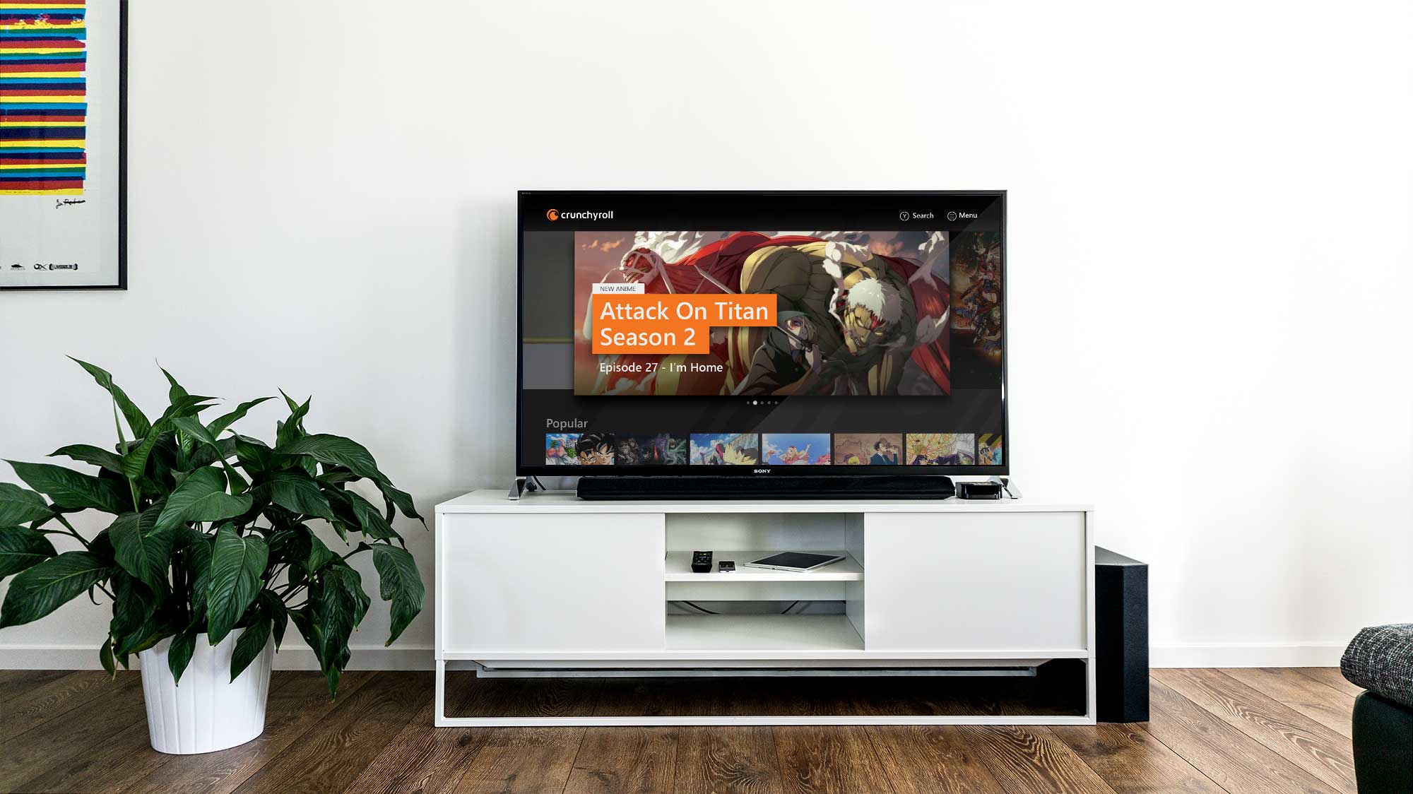
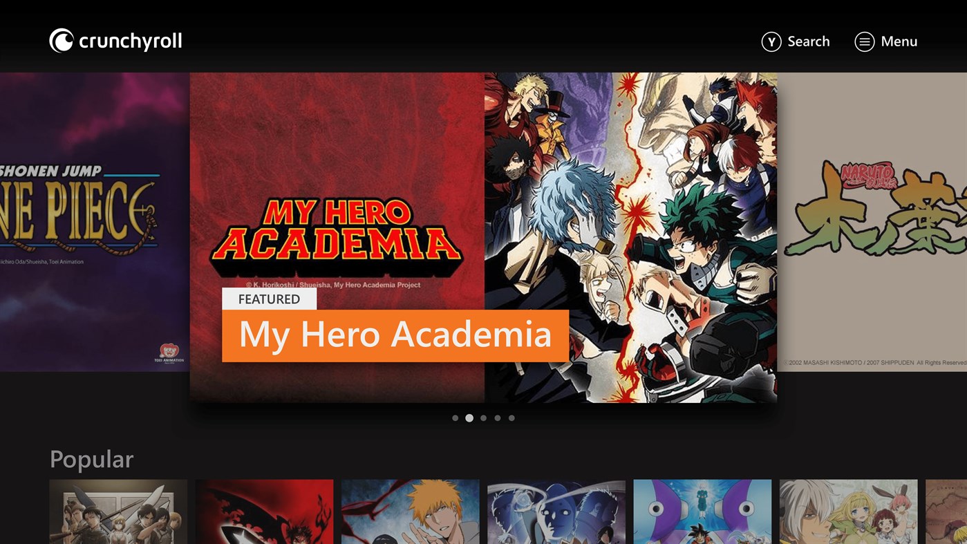
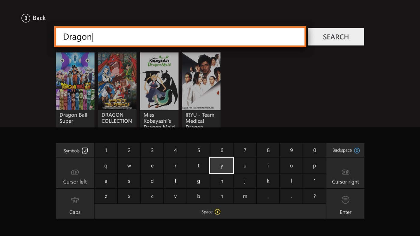
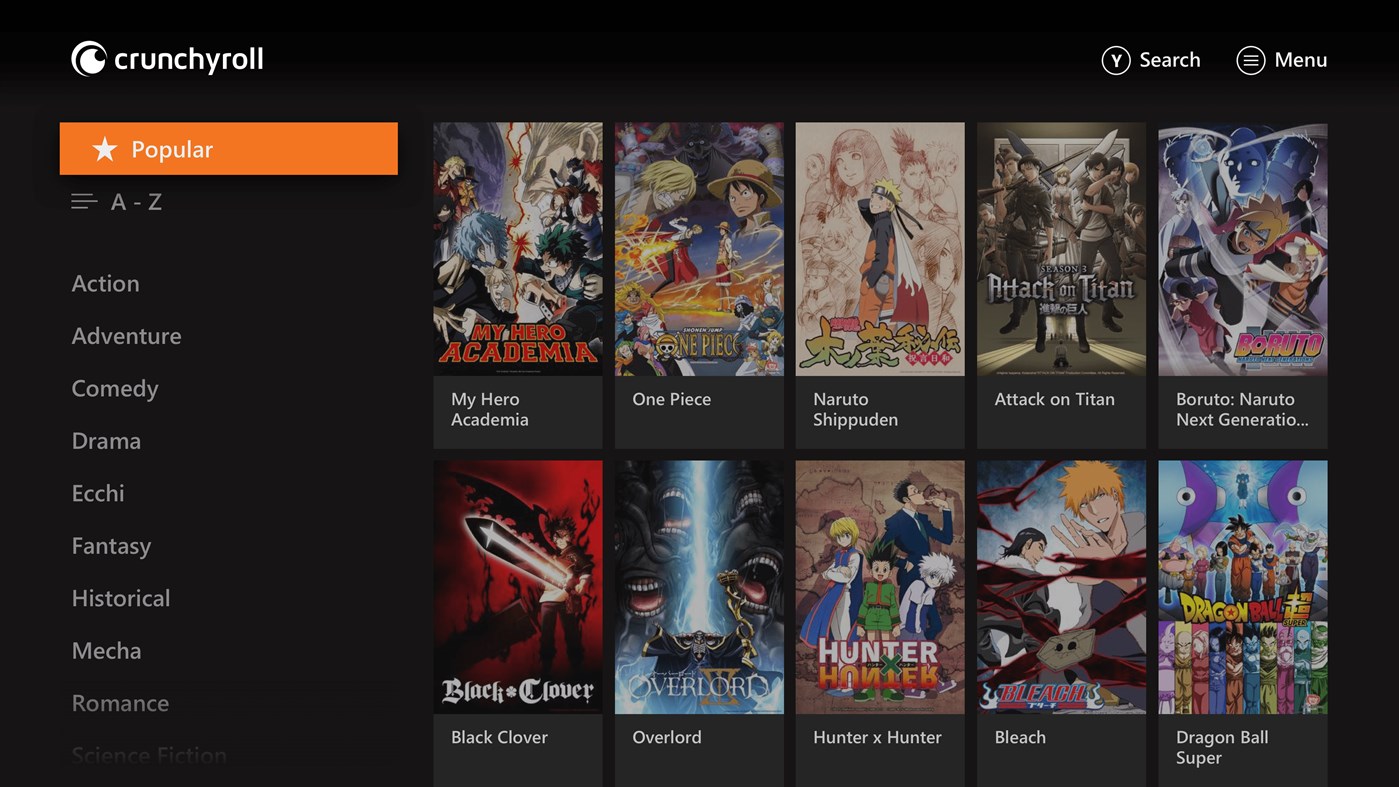
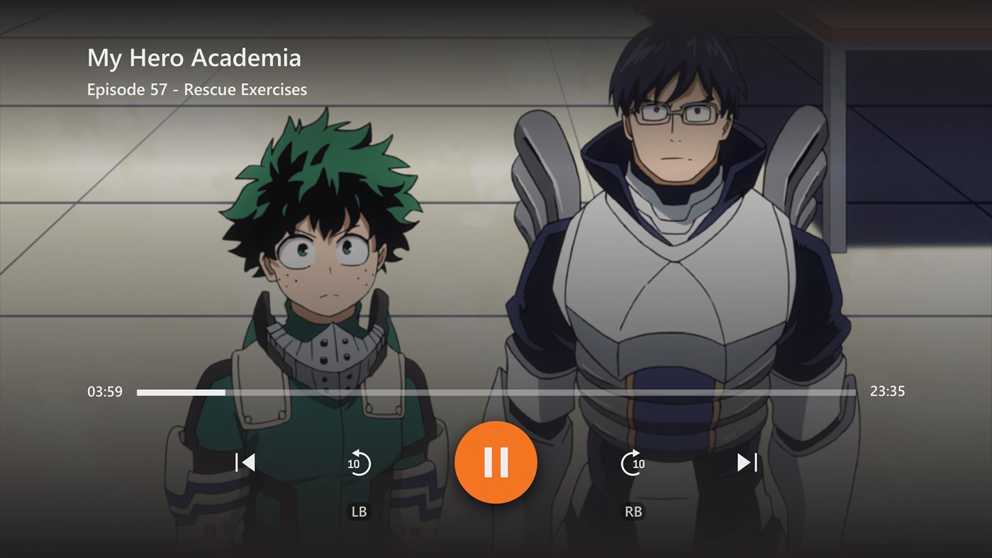
I worked on the redesign of the Crunchyroll Xbox One App in 2017. We launched it in 2019, and in 2020 it became the most popular Crunchyroll App among all TV consoles reaching more than 1 million active users. You can find a very detailed case study here. If you decide to read it, contact me for the password. Oh, and prepare a pot of coffee, it’s a long case study.
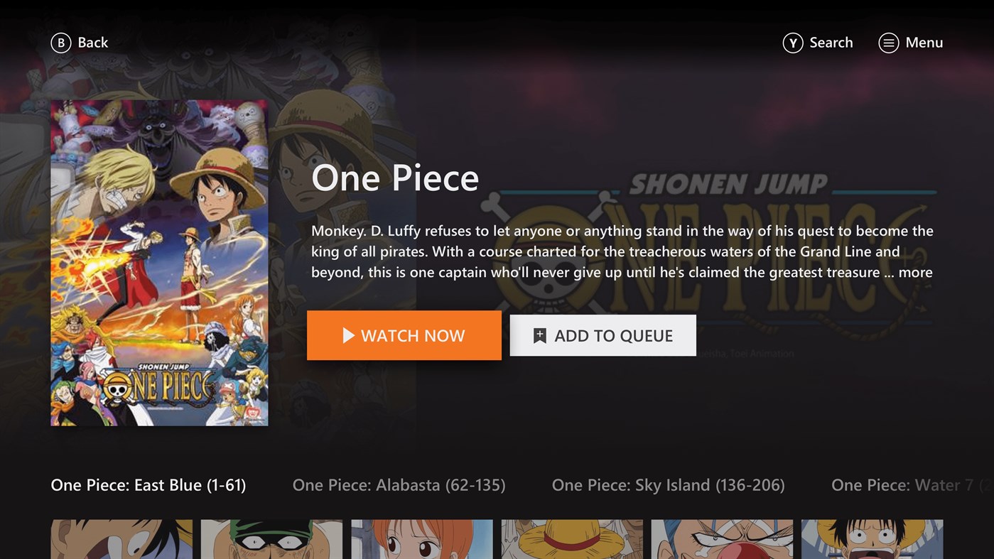
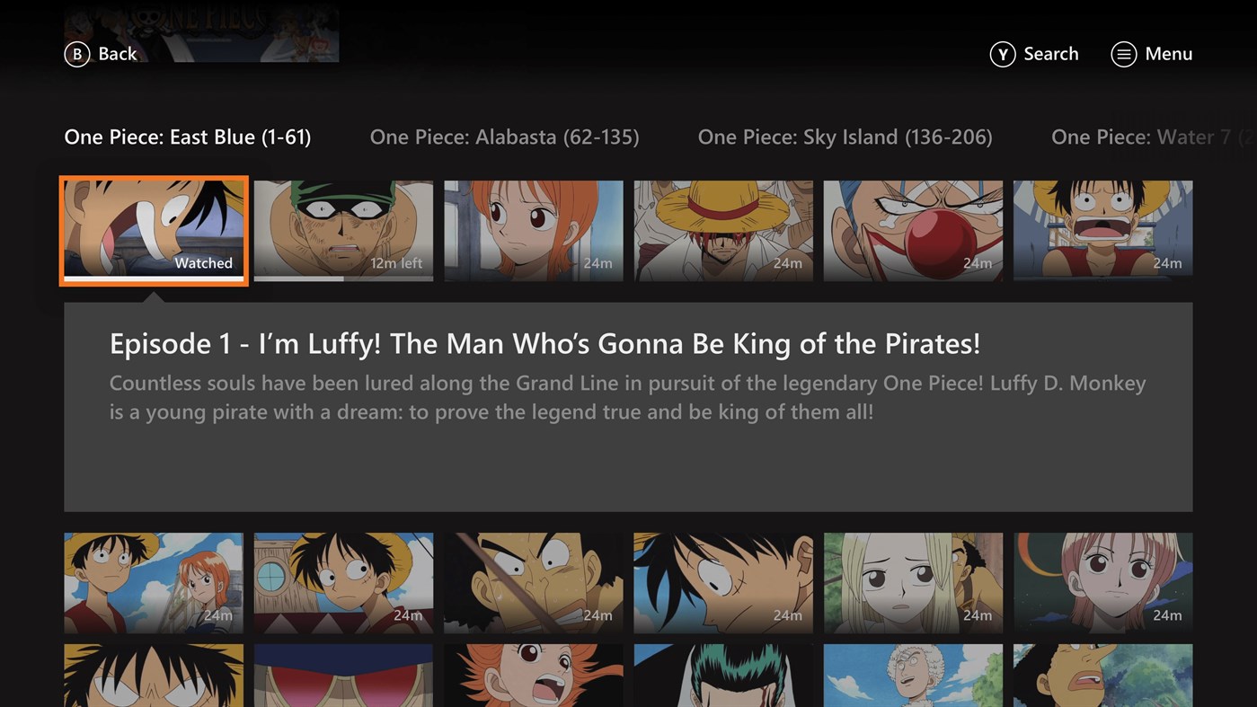
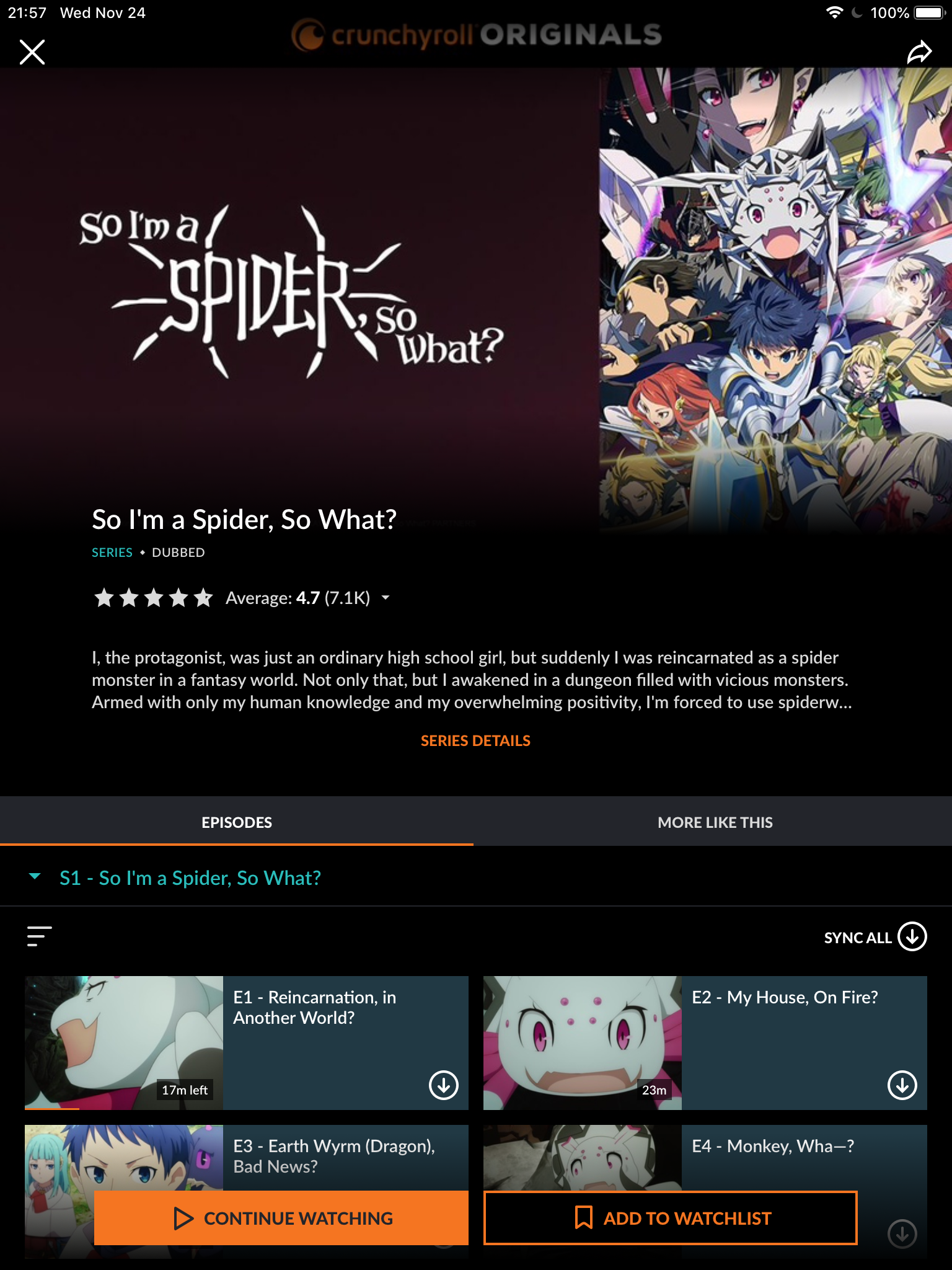
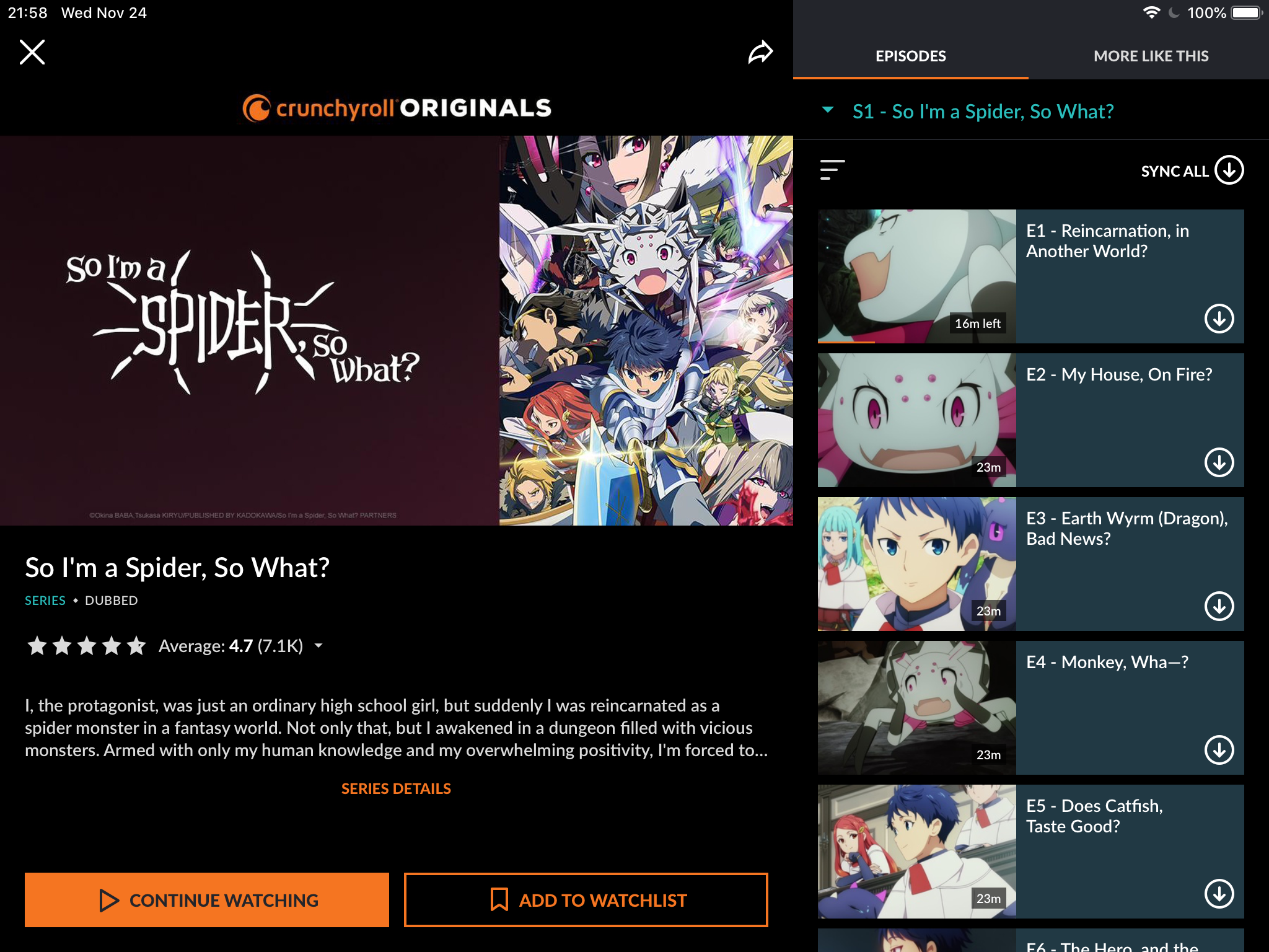
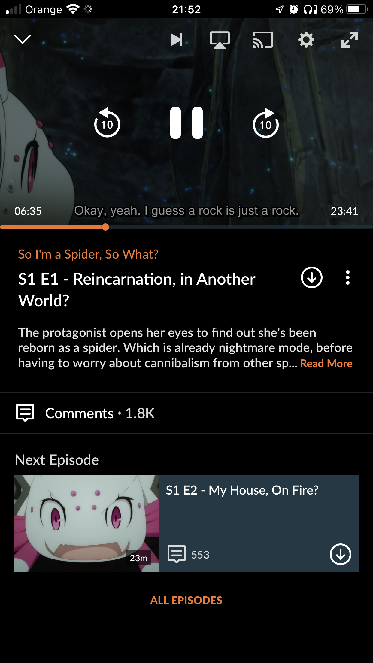
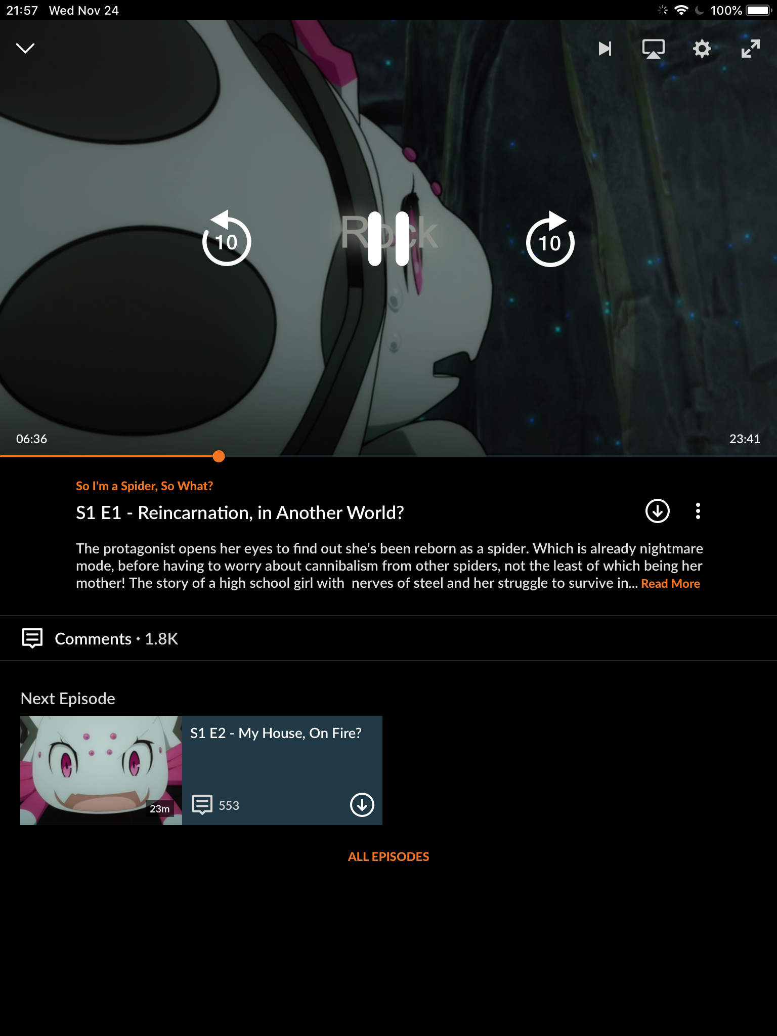
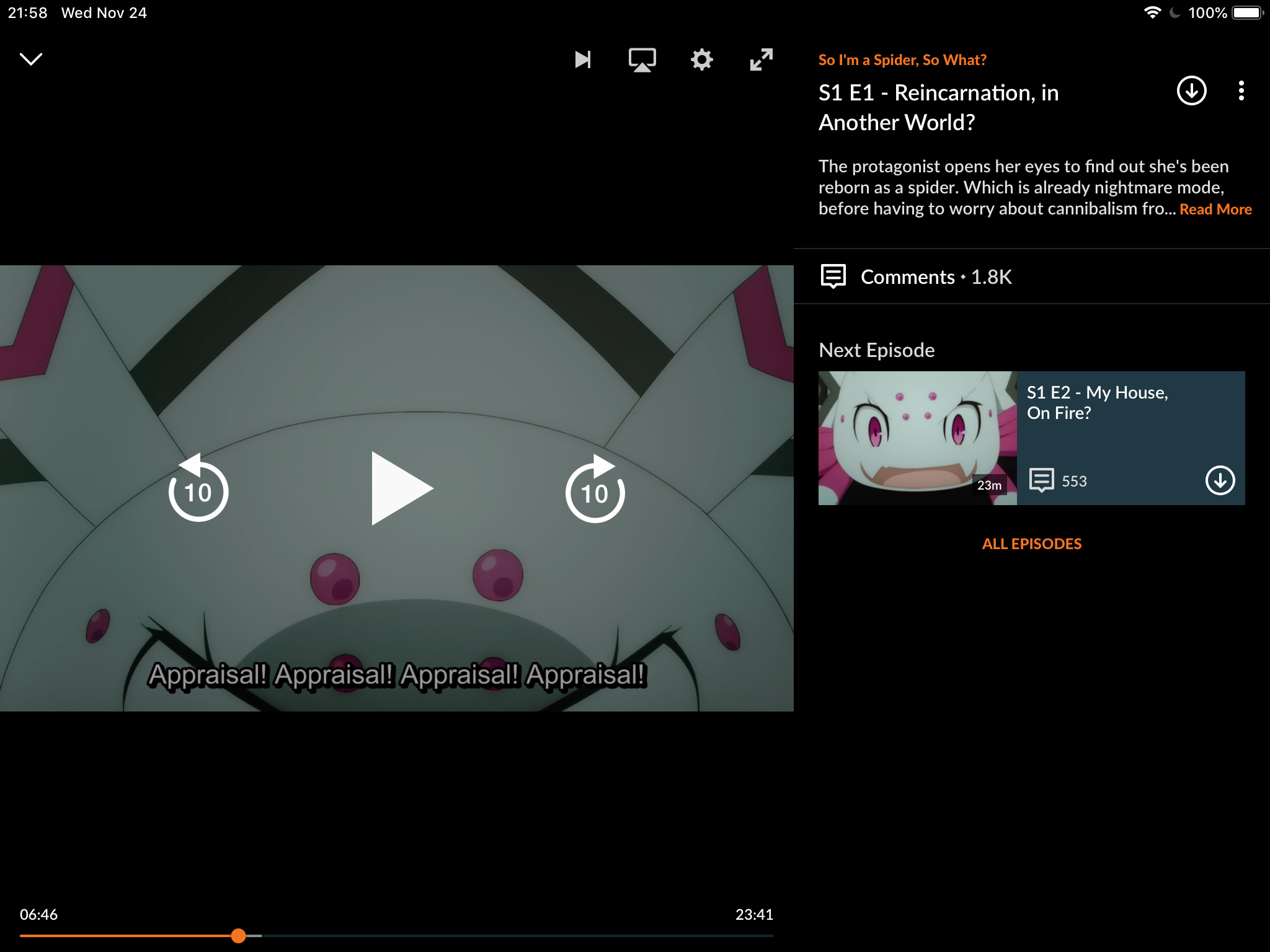
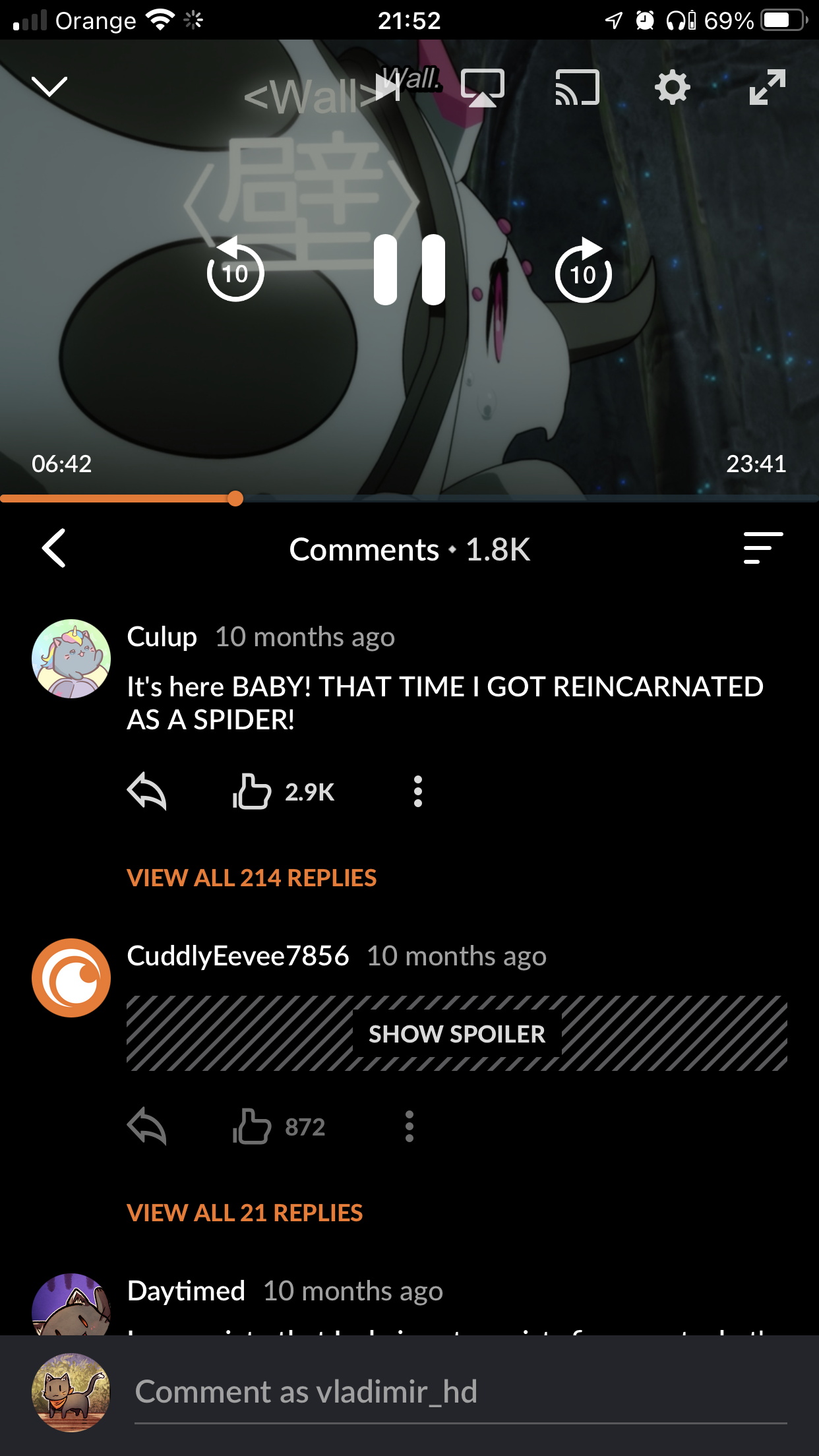
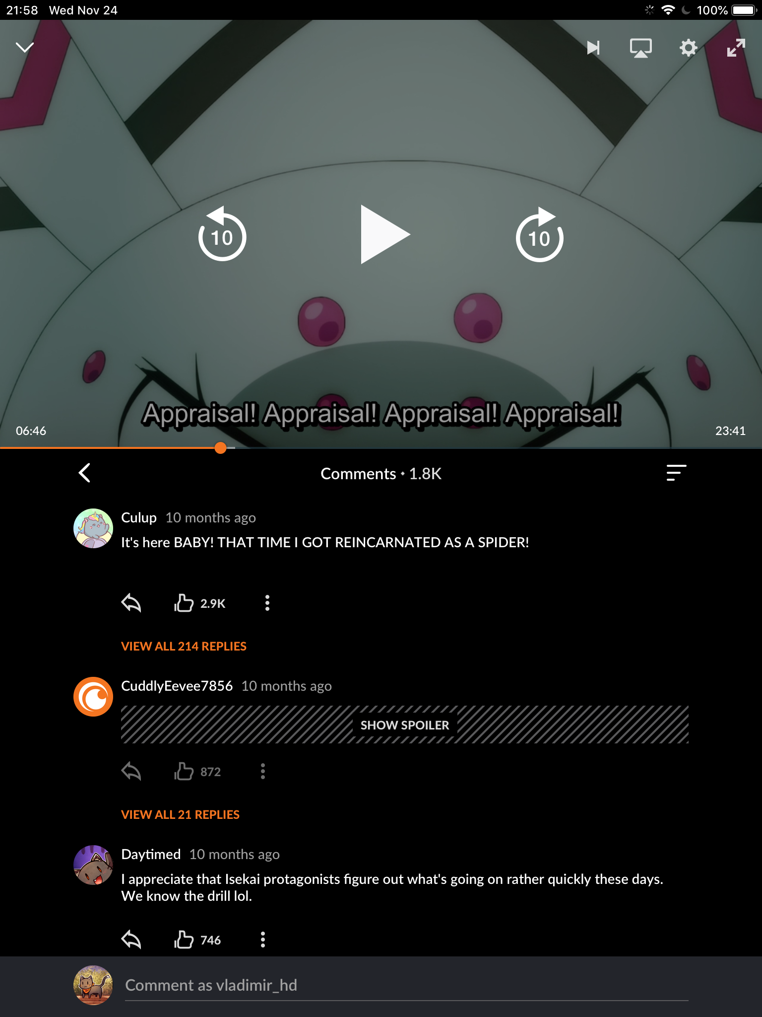
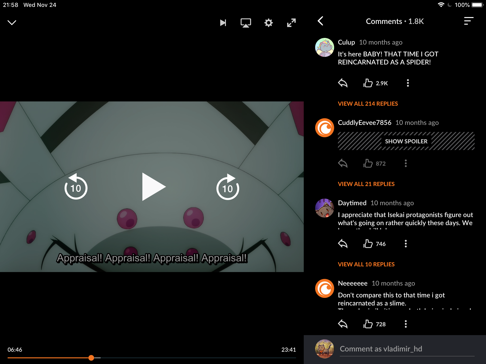
Crunchyroll Series Page
& Watch Page for iOS and Android
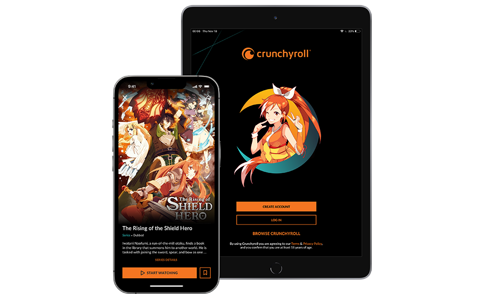
Back in 2019, two designers got stuck in designing these pages for our upcoming new App. Engineers were on their tail, asking for designs. They had strict deadlines and were already falling behind schedule. Because of that, the communication between these 2 designers and engineers became pretty bad. The product design leadership took a tough decision and re-assigned this task to 2 other designers, who were on my team.
As a result, we were in a pretty stressful situation:
- During the next 2 sprints (1 months), we had to deliver the design for one of the core experiences in the app. It took almost 3 months for 2 other designers to get to a point at which they were.
- We had 2 angry engineering teams with completely spoiled channels of communication.
As a manager, I had to encourage designers, help them achieve excellent results, and reconstruct the communication and collaboration with the engineering team.
I booked a meeting room with a big whiteboard for 4 hours and invited designers over. I brought sticky notes, printed user personas, paper, pens, etc.
I explained to my team the plan for this 4-hour session:
- Analyze what the 2 other designers did and understand where they failed.
- Analyze user personas and identify their main needs.
- Build user journeys.
By the end of this session, we had a clear understanding of several things:
- We knew where the other designers failed. First of all, the layout they were proposing was impossible to implement from an engineering standpoint. This meant we had to collect feedback from engineers as soon as possible, preferably at the stage of paper prototypes.
- We defined users’ needs, prioritized them, and knew what had to be included in the first release and what could wait.
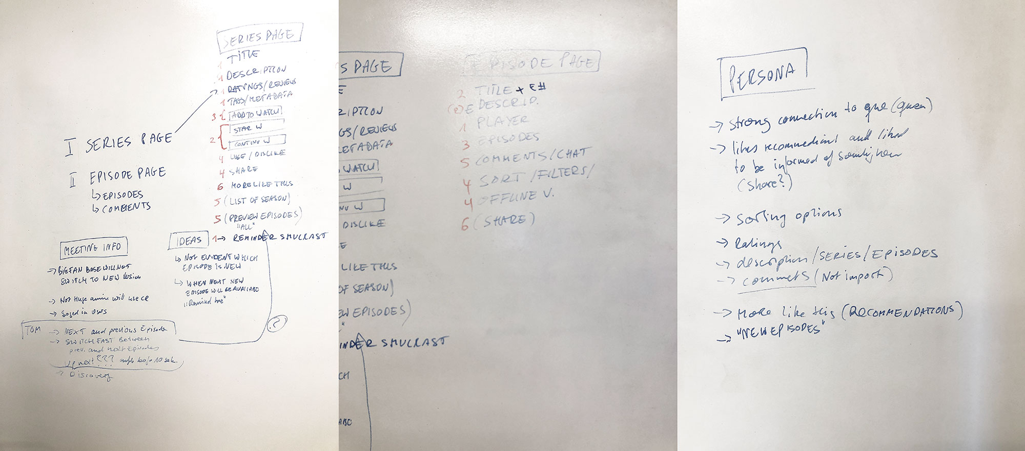
The following day I have scheduled another 4-hour session. The main goals were:
- Iterate fast on the designs, using pen and paper.
- Share our sketches with engineers and product manager to collect feedback.
- Sketch final design on paper.
For iteration, I decided to use the 360 sketching exercise. The main idea of the exercise is the next:
- Decide on the feature you want to explore.
- Set a timeframe (we used 15 minutes per feature) and give each designer paper and a different color pen.
- Sketch a version of the design, considering the users’ needs and technical possibilities.
- Set a 2nd timeframe (we used 5 minutes). Give your sketch to your colleague who’s sitting next to you in the clockwise direction and receive a sketch from another designer. Iterate on the designs you received from your colleague during the defined timeframe, using another pen color.
- Set a 3rd timeframe (we used 5 minutes). Give the sketch on which you iterated to your colleague who’s sitting next to you in the clockwise direction and receive a sketch from another designer. Iterate on the iterated sketch.
- Discuss in the group the findings, agree on the ideas with which to move forward.
- Sketch designs that would be shown to engineers and product manager.
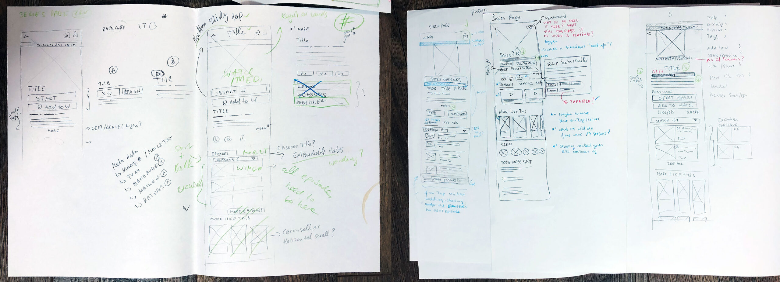
By the end of this exercise, we had amazing explorations and ideas. We then discussed the final design, sketched it, and presented it to engineers and the product manager. The engineering team was excited about the results and that they were involved in the feedback session at this stage. We have collected feedback, got back to the room, and sketched one more version based on the comments from our teammates. Designers had a clear vision and direction.
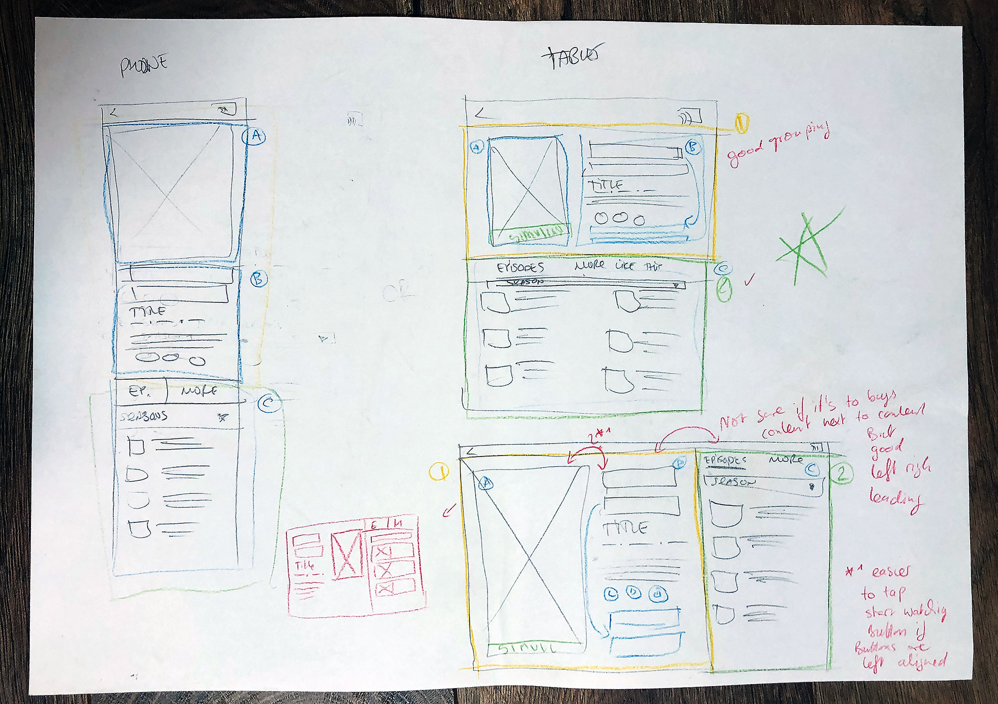
They spent the next 4 hours putting together wireframes for several main screens.
The following day, designers have presented the designs at the feedback session with the main stakeholders. I can’t even explain how surprised and excited product owners, engineering managers, and product design director were. They have provided the team with feedback and recommendations and expressed their gratitude for the fast and amazing work. I think I can skip explaining the feelings the designers had after the meeting. They were shining!
During the following 3 weeks, designers have transformed wireframes into high-fidelity designs, prepared all the necessary edge cases, screen sizes, design documentation, and delivered the designs to engineers on time. Engineers managed to build the interface before the deadline. As a result, the faith in the design department was restored, the communication improved, and new ways of collaboration were set in place.
The team managed to roll out the new version of the App to 1% of our users. Our UXR team then interviewed the users and brought feedback on the App behaviors, including this functionality. Based on the user testing results, the team adjusted the designs.

